
5 Common Design Mistakes People Make When Choosing a Whole-House Paint Palette
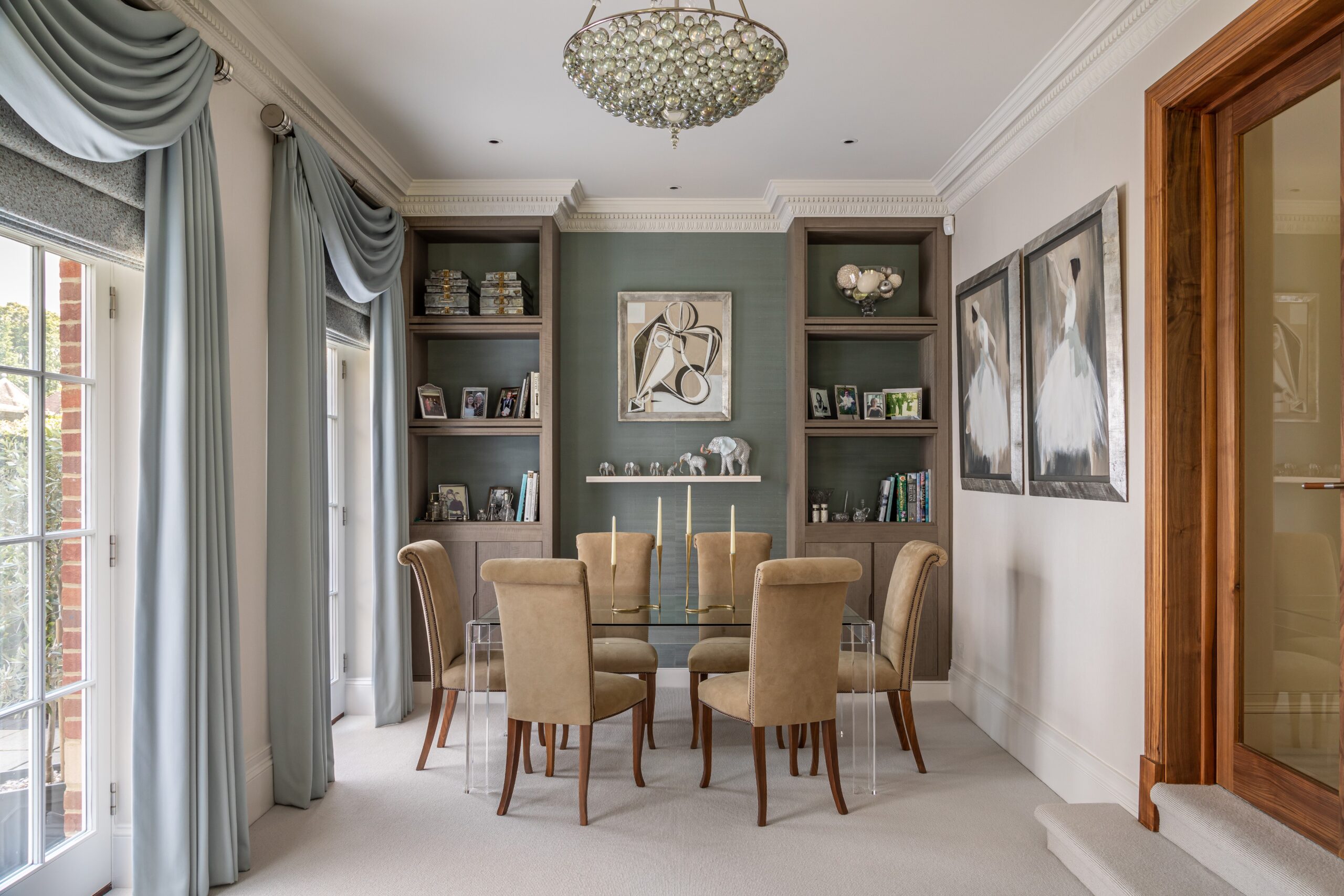
The majority of painting mistakes made in whole-house projects stem from the fact that color choices are made in isolation. A color might look good in one room, but it clashes with the room next to it.
Mistake #1: picking colors room by room
This is the mistake nearly everyone makes, usually without realizing it’s a mistake at all. You stand in the bedroom, fall in love with a soft sage, then walk into the hallway and pick a warm greige because it felt cozy in that spot. Each choice makes sense on its own. Together, they clash.
The problem is that houses aren’t a series of sealed boxes. Open floor plans, hallways, and sightlines mean your eye carries one room’s color straight into the next room before you’ve even registered you’ve moved. A living room and adjoining kitchen aren’t two color decisions – they’re one decision viewed from two angles.
The fix is to think in terms of a color story instead of individual picks. Choose a sequence that flows from the front door through to the back of the house with each room reading as a variation on a theme rather than a completely separate idea. Public and connected zones share a family of tones. Private rooms can shift more, but even then the transition should feel intentional rather than accidental.
Mistake #2: ignoring undertones
Every paint color possesses a slight pigment hidden under the main shade – a hint of blue, green, red, or yellow that becomes visible only when the color comes into contact with other surfaces. A greige color that seems warm and neutral washes with mauve close to a pink-toned rock benchtop, or appears dirty and green next to honey-colored wooden floors.
Right here is where a whole lot of otherwise good color preferences fail. Individuals evaluate paint chips against other paint chips, when the truth is the real assessment that counts is paint versus the stable things in the room that you can’t move – flooring, cabinetry, tile, benchtops, brick. Those fixed finishes have their own undertones, and your wall color has to sit comfortably beside them, not just look good on a sample at the store.
Read More: The Complete Guide to UPVC Windows and Doors Manufacturers in Gurugram
Before determining a color, hold it up against your actual floor sample, your actual cabinet door, your actual stone. If there’s any friction between them, you’ll instantly notice it and it’s much simpler to correct at the testing stage rather than after making three coatings on the wall.
Mistake #3: choosing colors under bad lighting
Paint color varies depending on the light source and time of day. What looks good under fluorescent lighting in the store may look terrible in your north-facing living room. Small paint swatches won’t give you a true picture of how the color will look in your home. The solution: paint large sample patches directly on the wall in different rooms. View them in daylight, then by lamp light in the evening. Watch how they respond to your specific window orientation – north, south, east, and west-facing rooms all shift a color differently across the day. This step feels slow when you’re eager to get started, but it’s the single biggest predictor of whether you’ll be happy with the result in six months.
Mistake #4: chasing trend colors instead of balance
Some of the trendiest colors like moody navy, deep forest green, and near-black have started to pop up in every design feed for a good reason. They photograph beautifully and feel fresh and modern. But painting your entire house in the “it” colors of the moment is a fast track to a dated home tomorrow, and nothing is cheap to correct like a total interior repainting.
The more pragmatic approach is the 60-30-10 rule. Sixty percent of the palette should be a durable, timeless, and easily sourced neutral that you can use for painting the main walls. It’s also the color that will tie the rest of the house’s tones together and keep it looking cohesive. Thirty percent should be a secondary neutral or tone that can decorate a lower wall, a feature joinery piece, or a connecting hallway. This is where it gets a bit more fun because you’re adding drama but not taking any risks. Ten percent is where the fun stuff lives – the trend-driven color.
Like a front door, a powder room, a piece of painted furniture, or an accent wall in a contained space. This isn’t about playing it safe, I promise. This is about ensuring you have control over where the drama sits. We’ve all been in homes where the color is just so loud it drowns everything out. They’re the only thing you see. Your house should be about the house first and the color second. The color should shine of course, but context is everything.
The other layer is the fixed architectural style you have. A heritage-era home with original cornicing and timber trims will usually sit a lot more contently with tones that respect it than a color forecast straight off the press.
Mistake #5: treating sheen as an afterthought
The finish you paint the color in does a lot more than most people think. Matte, eggshell, satin, and semi-gloss aren’t just design preferences. They alter how light reflects off the surface and how visible dings, scuffs, and imperfections are. They influence how easy the surface is to clean, as anyone who has scrubbed down a lump of cheese off a builder’s eggshell-backed wall with matte paint will tell you in salty language.
If trim and walls are in the same sheen, everything goes flat. Using predominantly one sheen can either quiet down a room or make it overly reflective. High glosses throw a ton of light and can practically read a newspaper in your walls; mattes absorb it and distractingly deaden color. Your choice goes beyond purely aesthetic considerations.
Getting sheen, undertone, and surface prep to work together across an entire house is a different skill set than picking colors you like. It usually pays to bring in people who do this daily, and if you’re weighing up whether to tackle a whole-home repaint yourself or hand it over, working with an experienced team of painters perth homeowners already trust is often what separates a palette that looks good on paper from one that actually looks right on the walls.
Why light reflectance value matters as much as the color itself
All colors have a Light Reflectance Value number ranging from 0 to 100. This number indicates how much light is reflected and how much is absorbed. Colors with a low LRV give off a darker impression because they absorb more light, while an LRV over 50 reflects more light and is seen as a brighter color.
It’s important to remember that the perfect color for a north-facing room is not necessarily the best color for a south-facing room. A dark, low-LRV shade in a windowless space or a room with a southern exposure can make it feel almost like a cell. The same color in a sun-drenched room facing the sun all through the day might appear intense and dramatic rather than stifling.
Instead of just focusing on what looks good, it’s better to consider which LRV range is appropriate for the amount of light that each room actually receives. Rooms with limited natural light require lighter colors to prevent them from feeling gloomy. Bright rooms can afford to have darker colors because they will appear cozy and inviting rather than light-craving.
The parts of the palette people forget: ceilings, trim, and doors
While walls command most of the decision-making attention, they are just one plane in a room. Ceiling paint, trim, skirting boards, and doors are part of the same visual system, and “white” is working much harder than you think it is. There is not one white – there are warm whites, cool whites, and stark whites, and the one you choose for the ceiling is either complementing the wall color beneath it or subtly working against it.
Read More: How to Prepare Your Homes Plumbing System for Extreme Weather Events
A sharp, professionally finished room tends to have a thoughtful relationship between these components: a wall color, a white for trim that is in keeping but different, and a ceiling hue that reads back or heightens the space, according to your ceiling height and light. Give this a miss and even a well-considered wall color will read a tad wrong, but no one will be able to tell why.
Getting it right the first time costs less than fixing it later
Choosing colors in haste can have expensive consequences. In 2019, a study of 135,000 home sales showed that homes with a black or dark-gray front door sold for as much as $6,271 more than expected (Zillow). That’s a pretty straightforward indicator of how much paint color decisions can influence the value of a property, versus how much it actually costs to paint your front door.
The same goes for attempting a total do-over after a handful of months because a color scheme never really gelled. Suddenly, it’s the cost of all the paint and labor and maybe a color consultation you didn’t budget for, the hourly rate for the moving company to cart all your furniture back and forth (twice!), and the lost days repainting while you juggle work, school, and trades schedules along with life. Not to mention the overall inconvenience and mess of doing it again. A gallon of paint and a brush are cheap compared to that.
A whole-house palette isn’t about picking five or six colors you like. It’s about understanding how those colors behave next to each other, next to your fixed finishes, and under your specific light, then having the finish and application skill to carry that plan through without it falling apart on the wall. Get the planning right, and the execution has a real shot at matching the vision you started with.

What are the benefits of the best 3D printing companies?

The Best Roofing Materials for Midwest Weather: A Homeowner’s Guide

How Labour Costs Impact Your Overall Painting Cost?
About Author
